YouTube Thumbnail Best Practices for Ultimate Views

Unlocking the Power of Thumbnails
Your YouTube thumbnail is the gateway to your video content. It's the first, and often only, impression you make on potential viewers. This listicle delivers eight YouTube thumbnail best practices to help you transform casual browsers into engaged viewers. Learn how to create click-worthy visuals that maximize your video's visibility and channel growth by understanding high contrast color schemes, the power of human faces, strategic text overlay, and more. Mastering these YouTube thumbnail best practices is essential for success on the platform.
1. High Contrast Color Schemes
High contrast color schemes are a cornerstone of effective YouTube thumbnail best practices. This strategy leverages the power of color to create thumbnails that instantly grab attention amidst the clutter of a busy YouTube feed. It works by using complementary colors, often opposites on the color wheel, to create visual tension and make key elements, such as titles or faces, "pop." The greater the difference in luminance (brightness) and chroma (color intensity) between the foreground (main subject) and background elements, the more your thumbnail will stand out, especially when viewers are quickly scrolling through search results or recommendations. This is crucial because thumbnails are often the first, and sometimes only, impression a viewer has of your video.
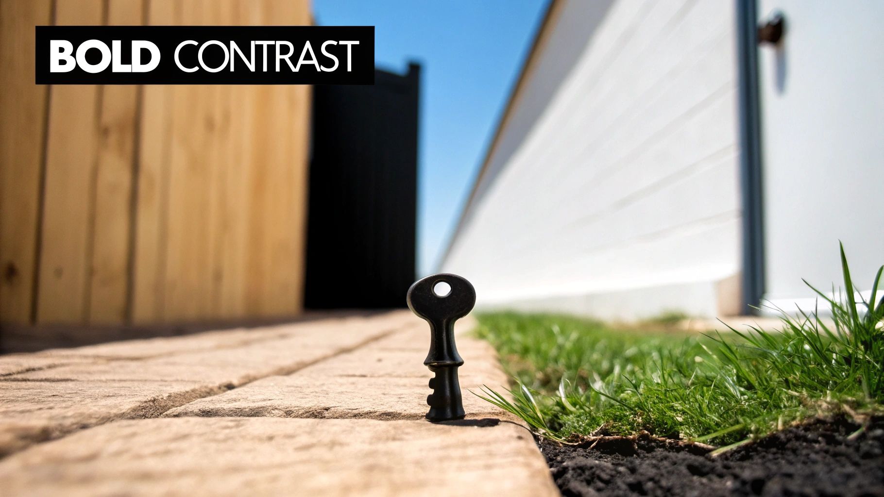
This technique relies on several key features: the use of color wheel opposites (like red and green, blue and orange, or yellow and purple) for maximum visual impact; clear separation between foreground and background elements to avoid a cluttered look; implementation of bold, saturated colors that remain vibrant even at small sizes; and the strategic use of white or black to achieve extreme contrast when paired with bright colors.
Examples of Successful Implementation:
- MrBeast: Frequently uses a high-contrast combination of bright blue and red in his thumbnails, creating an instantly recognizable and energetic style.
- Marques Brownlee (MKBHD): Employs vibrant, often neon, colors against dark, almost black, backgrounds to showcase the tech products he reviews. This draws the eye directly to the product and creates a sleek, modern aesthetic.
- Bright Side: Consistently uses a yellow and blue contrast, not just for visual impact but also for building strong brand recognition across their vast library of videos.
Pros:
- Immediate Attention Grabber: High contrast ensures your thumbnail stands out, even on smaller screens like mobile devices, where the majority of YouTube viewing takes place.
- Enhanced Readability: Clear contrast makes text overlays on your thumbnail much easier to read, conveying vital information about your video content quickly.
- Memorable Visual Identity: Consistent use of high contrast can contribute to a unique and recognizable brand identity for your channel.
- Scalability: The impact of high contrast remains effective even when thumbnails are displayed at smaller sizes in different areas of the YouTube platform.
Cons:
- Risk of Appearing Unprofessional: If overused or executed poorly, high contrast can look amateurish or even jarring to viewers.
- Brand Mismatch: The bold nature of high contrast might not be suitable for channels aiming for a more subtle, sophisticated, or minimalist aesthetic.
- Viewer Fatigue: Using the same high-contrast color scheme across all your videos can lead to visual fatigue and diminish its effectiveness over time.
Tips for Implementing High Contrast:
- Use Online Color Palette Generators: Tools like Adobe Color (color.adobe.com) or Coolors.co (coolors.co) can help you find effective and harmonious complementary color schemes.
- Test at Small Sizes: Always preview your thumbnails at the smallest size they will appear on YouTube to ensure the contrast remains impactful and the text is legible.
- Maintain Consistency: While variety is important, maintaining a degree of consistency in your approach to contrast can help build brand recognition for your channel.
- Consider Color Psychology: Use colors strategically. Red often conveys urgency or excitement, blue evokes trust and stability, and yellow grabs attention.
By understanding the principles of high contrast and applying these YouTube thumbnail best practices, you can significantly improve your video's click-through rate and overall performance. This technique, popularized by creators like MrBeast, Marques Brownlee (MKBHD), and Philip DeFranco, is a powerful tool for any YouTube creator looking to make their content stand out.
2. Emotional Human Faces
One of the most effective YouTube thumbnail best practices is incorporating close-up shots of emotionally expressive human faces. This technique capitalizes on our innate tendency to connect with human expressions. Our brains are wired to recognize faces and interpret emotions quickly, making thumbnails featuring expressive faces instantly relatable and more likely to be clicked. Exaggerated emotions, in particular, pique viewers' curiosity, prompting them to click and discover the content that evoked such a strong reaction.

This technique works because it establishes an immediate emotional connection with the viewer. By showcasing a clear emotion like surprise, excitement, or even confusion, the thumbnail gives a glimpse into the emotional landscape of the video. This resonates with viewers on a subconscious level, making them more invested in uncovering the story behind the expression. The use of high-resolution, well-lit facial images in close-up further amplifies the impact, ensuring the emotion is clearly readable. Ideally, the subject should make eye contact with the viewer to enhance engagement.
Features of Effective Emotional Thumbnails:
- Close-up shots of faces showing clear emotions (surprise, shock, excitement)
- Eye contact with the viewer when possible
- Exaggerated expressions that convey the video's emotional tone
- High-resolution, well-lit facial images
Pros:
- Creates immediate emotional connection with viewers
- Leverages innate human facial recognition patterns
- Communicates the emotional content of the video instantly
- Increases click-through rates by 30-40% according to various studies
Cons:
- Can seem manipulative if the facial expression doesn't match the video content
- May become cliché if overused across YouTube
- Requires a willing subject and good photography skills
Examples: Think of David Dobrik's wide-eyed surprised expressions in his vlogs, reaction channels like FBE (Fine Brothers Entertainment) showing genuine emotional responses, or Logan Paul using exaggerated facial expressions to convey excitement. These creators have effectively used this YouTube thumbnail best practice to build large and engaged audiences.
Tips for Implementation:
- Capture multiple facial expressions during filming: This gives you options when designing your thumbnail and allows you to choose the expression that best represents the video's content.
- Increase contrast and clarity on the face: Make the emotion easily readable by enhancing the clarity and contrast of the facial features in the thumbnail.
- Position faces in the right or center of the thumbnail: Studies have shown that positioning key elements like faces towards the right or center of an image tends to have a greater impact on viewers.
- Ensure the emotion matches the actual content: Authenticity is key. Misrepresenting the video's content with a misleading thumbnail can damage your credibility and disappoint viewers.
Why This Deserves a Spot on the List: Emotional human faces in thumbnails are a powerful tool for attracting viewers and increasing click-through rates. This technique taps into fundamental human psychology and provides an immediate, visceral connection with potential viewers. While it requires some skill and planning to execute effectively, the potential benefits for your YouTube channel make it a best practice worth mastering. Popularized by creators like David Dobrik, Shane Dawson, and reaction channels, the effectiveness of this technique is undeniable for a wide range of content, from vlogs and gaming videos to educational content and beauty tutorials.
3. Strategic Text Overlay
Strategic text overlay is a crucial YouTube thumbnail best practice that involves adding concise, high-impact text to your thumbnails. This text acts as a mini-billboard, instantly communicating your video's value proposition to potential viewers. It works by providing just enough information to pique their curiosity without revealing the entire story, ensuring the text remains legible even on smaller screens. Effective text overlays complement, rather than compete with, the visual elements of your thumbnail, creating a harmonious and engaging design.
This technique is especially effective because it clarifies the video's content immediately. For viewers quickly scanning through a sea of videos, a well-crafted text overlay can be the deciding factor in whether they click on yours. When phrased as a question or an incomplete statement, the text overlay can create an element of intrigue, further enticing viewers to click and discover the answer. This also improves accessibility for viewers who may be relying on screen readers or simply prefer to quickly grasp the video's topic. Furthermore, using strategic text overlays can significantly help your videos perform better in non-native language markets. Learn more about Strategic Text Overlay
Think of your thumbnail text as a headline – it's the first impression. While well-designed visuals are crucial, don't neglect the text overlay. Titles are a key element for attracting clicks. For a deeper dive into optimizing your titles, check out this guide on crafting compelling meta titles. Source: How to Write Meta Titles: The Complete Guide to SEO-Optimized Title Tags from Outrank.
Features of Effective Text Overlays:
- Concise Wording: Aim for 3-5 words maximum to avoid overwhelming the viewer.
- Bold, Sans-serif Fonts: Choose fonts that are highly readable, even at small sizes.
- Large Text Size: Ensure the text is easily legible on mobile devices (consider testing at 150px width).
- Strategic Placement: Position the text so it doesn't obstruct key visual elements or important details in the thumbnail image.
Pros:
- Clarifies video content instantly
- Creates curiosity and encourages clicks
- Improves accessibility
- Boosts performance in non-native language markets
Cons:
- Can clutter the thumbnail if not done properly
- Text may become illegible at smaller sizes
- Potential for YouTube's algorithm to flag excessive text
Examples:
- Veritasium: Uses scientific questions as thumbnail text, sparking curiosity.
- Philip DeFranco: Employs short, provocative phrases on news thumbnails to grab attention.
- Graham Stephan: Features money figures in his financial advice videos, immediately conveying the topic.
Tips for Implementing Strategic Text Overlays:
- Use Drop Shadows or Outlines: This makes text readable against any background.
- Test Thumbnail at Mobile Size: Ensure legibility on smaller screens.
- Use Action Words, Numbers, or Questions: Increase engagement and click-through rates.
- Maintain Consistent Text Placement and Styling: Create a cohesive brand identity across your channel.
- Create Intrigue, Don't Summarize: Use text to pique interest rather than giving away the entire video's content.
By incorporating these YouTube thumbnail best practices, you can significantly improve your click-through rate and attract a wider audience. Strategic text overlay is a powerful tool that shouldn't be overlooked in your quest for YouTube success.
4. Custom Thumbnails with Brand Consistency
One of the most effective YouTube thumbnail best practices is developing custom thumbnails with consistent branding. This approach elevates your channel's presence from a collection of individual videos to a cohesive, recognizable brand. In the crowded landscape of YouTube, where viewers are constantly bombarded with content, a consistent visual identity helps your videos stand out and attract clicks. This strategy hinges on developing signature visual elements – colors, frames, layouts, fonts, and even logo placement – that remain consistent across your videos while still allowing for content-specific variation.
This method works by creating a visual shorthand for your channel. Viewers begin to associate those specific elements with your content, making it easier for them to identify your videos in search results and suggested video feeds. Think of it like a familiar logo; even without reading the name, you instantly recognize brands like Nike or McDonald's. Consistent thumbnails achieve the same effect for your YouTube channel.
Features of Branded Thumbnails:
- Consistent Color Palette: Use a color palette aligned with your channel's overall brand.
- Recognizable Template or Framework: Develop a reusable template or framework for your thumbnails that can be adapted for individual videos.
- Strategic Logo Placement: Include your logo, but ensure it doesn't overwhelm the thumbnail.
- Consistent Font Choices and Styling: Maintain consistent fonts and styling for all text elements.
Pros:
- Builds Immediate Channel Recognition: Viewers will instantly recognize your videos in search results and suggested videos.
- Creates a Perception of Professionalism and Established Content: Consistent branding signals a commitment to quality and professionalism.
- Helps Returning Viewers Quickly Identify Your New Content: Subscribers can easily spot your latest uploads.
- Streamlines Thumbnail Creation Process: Using established templates significantly speeds up the creation process.
Cons:
- May Limit Creative Flexibility for Individual Videos: Strict adherence to a template may restrict creativity.
- Can Become Visually Repetitive if Not Balanced with Fresh Elements: It's important to introduce variations and fresh elements within your branding to avoid monotony.
- Requires Upfront Investment in Design and Branding: Developing a strong brand identity requires initial time and effort.
Examples of Successful Implementation:
- Kurzgesagt – In a Nutshell: Their distinctive, minimalist illustration style and limited color palette are instantly recognizable.
- Peter McKinnon: His consistent dark aesthetic with bold white text creates a strong and memorable brand.
- Tasty: Their overhead food shots with consistent text placement and vibrant colors instantly convey their brand.
- The Infographics Show: Their bold, graphic style and consistent use of characters and icons make their videos easily identifiable.
Actionable Tips for YouTube Creators:
- Create a Basic Template: Design a basic template in Photoshop or Canva that can be easily modified for each video. Learn more about Custom Thumbnails with Brand Consistency
- Develop Layout Variations: Create 2-3 layout variations within your brand system to cater to different content types.
- Reserve Zones for Text and Imagery: Designate specific areas within your thumbnail for text and imagery to maintain visual balance.
- Consider Color Coding: Use color coding within your brand palette to differentiate between different content series.
- Create a Style Guide: Develop a style guide for your thumbnails to maintain consistency, especially as your channel grows and potentially involves multiple editors.
When and why should you use this approach? Implementing branded thumbnails is crucial for any YouTube creator aiming to build a recognizable presence and foster a loyal audience. Whether you're a gaming channel owner, educational content creator, digital marketer, or social media influencer, consistent branding in your thumbnails is a powerful tool to attract viewers, reinforce your brand message, and ultimately drive channel growth. This practice makes a substantial difference in how professionally your channel is perceived and how easily viewers can find your content amidst the vast sea of videos on YouTube. It's an investment that pays dividends in long-term channel growth and recognition.
5. Before and After Comparisons
Before and after comparisons are a powerful tool for creating compelling YouTube thumbnails. This technique leverages visual storytelling to immediately communicate the value proposition of your video by showcasing a clear transformation or surprising outcome. The stark visual contrast between the starting point and the end result piques viewers' curiosity and encourages clicks. This strategy is especially effective for content where a distinct change is demonstrated, such as tutorials, makeovers, DIY projects, and educational videos.
This technique earns its place amongst YouTube thumbnail best practices because it offers a concrete, visual representation of the value viewers will receive. Rather than simply promising a result, the before and after comparison shows it. This approach utilizes several key features: side-by-side images displaying the transformation, visual indicators like arrows or lines connecting the before and after states, a clear visual hierarchy emphasizing the difference, and often text reinforcing the change (e.g., "Amazing Result!"). Think of a fitness channel showcasing a weight loss journey or a makeup artist revealing a dramatic makeover – the before and after comparison instantly grabs attention.
Pros:
- Immediately communicates video value proposition through visual proof.
- Creates curiosity about the process between before and after.
- Particularly effective for tutorials, DIY, makeovers, and educational content.
- Shows concrete results rather than just promising them.
Cons:
- Requires high-quality photography of both states.
- Limited applicability for certain content types (e.g., vlogs, gaming highlights).
- Risk of appearing clickbaity if the transformation is exaggerated.
Examples:
- Home renovation channels showing room transformations
- Fitness channels displaying physical progress
- Makeup artists demonstrating before/after makeovers
- Photoshop tutorial channels showcasing image editing results
- Cooking channels presenting raw ingredients versus the finished dish
Tips for Effective Before and After Thumbnails:
- Ensure consistent lighting and composition between before/after images: This creates a professional look and avoids distracting discrepancies.
- Use a clear dividing line or split screen effect for clarity: A distinct separation makes it easy for viewers to compare the two states.
- Position the 'after' image on the right to align with reading direction in Western markets: This feels natural to the eye and guides the viewer's gaze.
- Highlight the most dramatic elements of the transformation: Draw attention to the key changes that deliver the most impact.
- Consider using arrows or motion lines to draw attention to key changes: These visual cues can further emphasize the transformation.
Popularized By:
The success of before and after thumbnails can be seen across various YouTube niches. HGTV renovation shows' YouTube channels, fitness influencers like Chloe Ting, DIY channels like 5-Minute Crafts, and beauty transformation channels have effectively leveraged this technique to attract viewers. By demonstrating clear, compelling transformations in their thumbnails, these creators have utilized a powerful visual strategy that strongly contributes to their channel's success. By understanding and applying these YouTube thumbnail best practices, you can significantly improve your click-through rates and grow your audience.
6. Thumbnail A/B Testing: A Data-Driven Approach to Higher Click-Through Rates
Thumbnail A/B testing is a crucial YouTube thumbnail best practice that elevates thumbnail design from guesswork to a science. It's a data-driven approach for optimizing click-through rates (CTR) by systematically testing different thumbnail designs against each other. This method allows you to understand what truly resonates with your audience and significantly boost your channel's performance over time. This is why it deserves a prominent place in any list of YouTube thumbnail best practices.
How it Works:
The process involves creating multiple thumbnail variations for the same video, each with controlled differences. You then systematically rotate these thumbnails, publishing them at different times. During the testing period, you collect data focusing on key metrics like CTR and audience retention. Finally, you analyze this data and iteratively improve your thumbnail designs based on the results.
Features of Effective A/B Testing:
- Creation of multiple thumbnail variations: These variations should have controlled differences. For instance, change only the text, the main image, or the dominant color between versions for clear, interpretable results.
- Systematic rotation of thumbnails: Ensure each thumbnail version runs for a sufficient period (at least 24-48 hours) to gather statistically significant data.
- Data collection focusing on CTR and audience retention: While CTR is paramount, also consider audience retention. A high CTR with low retention suggests a misleading thumbnail, which can harm your channel in the long run.
- Iterative design improvements based on performance data: Use the data gathered to refine your designs and develop a unique thumbnail style that consistently performs well for your specific audience.
Pros:
- Data-driven insights: Provides concrete data on what actually drives clicks for your specific audience.
- Eliminates subjectivity: Removes guesswork and subjective decision-making from the thumbnail design process.
- Improved channel performance: Can significantly improve CTR and overall channel performance through continuous optimization.
- Audience understanding: Helps identify specific visual elements (colors, fonts, images, etc.) that resonate with your target audience.
Cons:
- Time investment: Creating multiple thumbnail versions requires a time commitment.
- External factors: Results can be influenced by timing, audience shifts, and other external factors beyond your control.
- Analytics limitations: YouTube's analytics platform has some limitations that can make perfect A/B testing challenging.
Examples of Successful Implementation:
- MrBeast: Known for testing up to 20 thumbnail variations for major videos to ensure maximum impact.
- Linus Tech Tips: Systematically tests different facial expressions and thumbnail compositions to optimize CTR.
- Game Theory: Leverages A/B testing to optimize the presentation of their theories and maximize audience engagement.
Actionable Tips for YouTube Creators:
- Change one element at a time: Isolate variables by modifying only one major element (text, image, or color) between thumbnail versions.
- Sufficient testing duration: Allow each thumbnail version to run for at least 24-48 hours to gather enough data for meaningful analysis.
- Document your findings: Keep track of what works and develop a personal 'formula' for creating high-performing thumbnails for your channel.
- Utilize YouTube Studio: Use YouTube Studio to change thumbnails and track CTR changes over time.
- Consider the full context: A high CTR with low audience retention might indicate a misleading thumbnail, which can negatively impact your channel's long-term growth. Learn more about Thumbnail A/B Testing to delve deeper into this topic.
Why This Matters:
In the competitive landscape of YouTube, a compelling thumbnail is essential. A/B testing provides a systematic way to improve your thumbnails, attract more viewers, and ultimately grow your channel. You can learn more about advanced techniques and strategies from YouTube strategists like Roberto Blake and major media companies with a YouTube presence. This approach is especially valuable for Gaming Channel Owners, Educational Content Creators, Digital Marketers, and Social Media Influencers seeking to maximize their reach and impact.
7. Pattern Interruption Techniques
In the crowded landscape of YouTube, grabbing a viewer's attention is paramount. Effective YouTube thumbnail best practices are crucial for achieving this, and pattern interruption techniques offer a powerful way to stand out. This method involves designing thumbnails that visually break expectations and disrupt the typical scrolling experience. By defying common visual patterns, you exploit the brain's natural tendency to notice anomalies, compelling viewers to pause and investigate. This technique is particularly effective when employed as part of a broader strategy encompassing YouTube thumbnail best practices.
How it Works:
Pattern interruption leverages the element of surprise. When viewers are accustomed to seeing rows of similar thumbnails within a specific niche, a thumbnail that drastically deviates from the norm will naturally draw the eye. This could involve unexpected visual elements, optical illusions, unusual cropping, or even elements that seem to break the boundaries of the thumbnail frame itself. This disruption creates a moment of intrigue and encourages clicks.
Features of Pattern-Interrupting Thumbnails:
- Unexpected Visual Elements: These could include incongruous objects, surprising color combinations, or unusual character poses.
- Optical Illusions/Impossible Scenarios: Think bent realities, objects defying gravity, or perspectives that don't quite add up.
- Strategic Use of Negative Space/Unusual Cropping: Cropping an image in an unconventional way or using negative space creatively can create a sense of mystery and draw the eye.
- Breaking Frame Boundaries: Elements that appear to extend beyond the thumbnail's edges create a sense of dynamism and break the monotony of the standard rectangular format.
Pros:
- Cuts Through Viewer Fatigue: In saturated niches, pattern interruption provides a refreshing change from the sea of similar thumbnails.
- Creates Immediate Curiosity: The unexpected nature of the visuals sparks cognitive engagement and a desire to understand the context.
- Enhances Standout Potential: Helps your videos stand out even when competitors use similar subject matter or imagery.
Cons:
- Risk of Appearing Gimmicky: If the visual disruption isn't relevant to the video's content, it can feel misleading and damage trust.
- Inconsistency with Brand Identity: Overusing this technique can make your channel appear disjointed and lacking a clear visual style.
- Higher Creative Effort: Crafting effective pattern-interrupting thumbnails requires more thought and design work than standard approaches.
Examples:
- Vsauce: Michael Stevens frequently uses optical illusions or impossible objects in his thumbnails to pique interest in his science-based content.
- Corridor Crew: Known for their VFX expertise, Corridor Crew often creates impossible scenarios or visually striking effects in their thumbnails.
- Mark Rober: This former NASA engineer uses unexpected visual juxtapositions and intriguing setups in his engineering and experiment videos.
Tips for Implementing Pattern Interruption:
- Study Your Niche: Understand the common visual conventions and themes used in your niche, then strategically deviate from them.
- Break the Frame: Use elements that appear to extend beyond the thumbnail's borders to create a sense of depth and movement.
- Create Visual Puzzles: Design thumbnails that present a mini-mystery or visual puzzle that can only be resolved by watching the video.
- Cognitive Dissonance: Combine unexpected elements that create a sense of cognitive dissonance, prompting viewers to click and resolve the incongruity.
- Relevance is Key: Avoid using pattern interruption purely for shock value. Ensure the visual disruption is directly related to the video's content.
Why This Technique Deserves Its Place in YouTube Thumbnail Best Practices:
Pattern interruption offers a significant advantage in the competitive world of YouTube. By capturing attention and sparking curiosity, it can significantly increase click-through rates and help your videos gain more visibility. When used effectively and thoughtfully, this technique is a valuable tool for any YouTube creator looking to elevate their thumbnail game and achieve greater success. While other YouTube thumbnail best practices focus on clarity and information, pattern interruption prioritizes grabbing attention in a visually cluttered environment. This makes it a crucial strategy for any channel seeking growth.
8. Visual Hierarchy and Focal Points
Creating effective YouTube thumbnails requires more than just a catchy image. You need to actively guide the viewer's eye to the most important information within a fraction of a second. This is where visual hierarchy and focal points, one of the most crucial YouTube thumbnail best practices, come into play. This technique involves strategically arranging elements within your thumbnail to control attention flow and emphasize key information, making your thumbnails more engaging and effective.
Visual hierarchy utilizes design principles like size, color, contrast, and position to create a clear distinction between primary and secondary focal points. This ensures viewers instantly understand the core message of your video, even when quickly scanning search results or suggested videos. Think of it like a billboard – you need to grab attention and convey meaning with limited space and time.
Features of Effective Visual Hierarchy:
- Clear Primary Focal Point: An immediately obvious element that draws the viewer's eye first.
- Strategic Layering: Visual elements are arranged by importance, with the most crucial information at the forefront.
- Size Contrast: Larger elements appear more important and draw attention, while smaller elements provide supporting context.
- Visual Design Principles: Incorporating principles like the rule of thirds helps to create balanced and visually appealing compositions.
Pros of Using Visual Hierarchy:
- Guides Viewer Attention: Directs viewers to the most compelling parts of your thumbnail first.
- Reduces Visual Confusion: Prevents thumbnails from appearing cluttered or overwhelming, especially with complex subject matter.
- Effective Communication: Maximizes information transfer in the limited viewing time afforded to thumbnails.
- Mobile-Friendly: Particularly important on mobile devices where screen real estate is limited and viewing time is even shorter.
Cons of Using Visual Hierarchy:
- Requires Design Knowledge: Implementing this technique effectively requires a basic understanding of visual design principles.
- Challenging with Complex Subjects: Can be difficult to achieve a clear hierarchy with visually busy content.
- More Post-Processing: May involve more deliberate composition and editing than simpler thumbnail designs.
Examples of Successful Implementation:
- Peter McKinnon: Often uses depth of field to isolate his subjects against blurred backgrounds, creating a clear focal point.
- Film Theory/Game Theory: These channels frequently use bright, highlighted elements against darker surroundings to draw attention to key information.
- Casey Neistat: Masterfully positions himself in optimal focal positions within his thumbnails, often utilizing the rule of thirds.
Actionable Tips for Implementing Visual Hierarchy:
- Rule of Thirds: Use the rule of thirds grid to position key elements at the intersection points for a naturally balanced composition.
- Create Depth: Utilize foreground, midground, and background elements to add visual interest and depth to your thumbnail.
- Size Matters: Make the most important element significantly larger than secondary elements to establish a clear hierarchy.
- Selective Focus: Employ selective blur, vignetting, or darkening to direct focus to the main subject.
- Small Screen Test: Always test your thumbnails at small sizes to ensure the hierarchy remains clear and the focal point is easily identifiable.
Why Visual Hierarchy Deserves Its Place in the List:
Visual hierarchy and focal points are essential for maximizing the effectiveness of YouTube thumbnails. By understanding and implementing these YouTube thumbnail best practices, creators can dramatically improve click-through rates and overall channel performance. This technique, popularized by creators like Peter McKinnon, Film Theory/Game Theory, Casey Neistat, and professional photographers transitioning to YouTube, is a cornerstone of successful thumbnail design. It ensures that your thumbnails are not only visually appealing but also effectively communicate the value of your content, enticing viewers to click and watch.
8-Point YouTube Thumbnail Best Practices Comparison
| Technique | Complexity | Resources | Outcomes | Ideal Use Cases | Advantages |
|---|---|---|---|---|---|
| High Contrast Color Schemes | Medium | Moderate | Increased attention and readability even at small sizes | Entertainment & mobile-focused channels | Immediate visual pop and memorable identity |
| Emotional Human Faces | Medium | Moderate | Boosted click-through rates through emotional appeal | Vlogs, reaction, and personality-driven channels | High engagement and relatability |
| Strategic Text Overlay | Low-Medium | Low | Quick content clarification and curiosity generation | Educational, news, and tutorial videos | Enhanced clarity and accessibility |
| Custom Thumbnails with Brand Consistency | High | High | Strong channel recognition and professional look | Established brands & diverse-content channels | Consistent branding and professional image |
| Before & After Comparisons | Medium | Moderate | Clear demonstration of transformation and results | Tutorials, makeovers, DIY projects, educational content | Immediate value communication & visual storytelling |
| Thumbnail A/B Testing | High | High | Evidence-based improvements in click-through rates | Channels focused on performance optimization | Data-driven refinement & reduced guesswork |
| Pattern Interruption Techniques | High | Moderate | Increased curiosity by cutting through visual monotony | Saturated niches or channels needing standout visuals | Distinctive, eye-catching designs |
| Visual Hierarchy & Focal Points | Medium | Moderate | Key elements readable at a glance | Thumbnails with complex or multiple elements | Streamlined viewer attention & effective messaging |
Taking Your Thumbnails to the Next Level
Mastering YouTube thumbnail best practices is crucial for any creator aiming to grow their channel in 2025. From employing high-contrast color schemes and showcasing emotional human faces to using strategic text overlays and A/B testing, every element discussed in this article contributes to a cohesive and effective thumbnail strategy. Remember the power of visual hierarchy, focal points, and pattern interruption to truly capture attention. By consistently applying these YouTube thumbnail best practices, and developing a unique brand style, you'll transform your click-through rate and significantly boost viewer engagement, setting the stage for increased watch time and subscriber growth. These aren't just tips; they're essential tools for YouTube success, allowing your content to stand out amidst the ever-growing competition.
Want to effortlessly implement these YouTube thumbnail best practices and elevate your channel's visuals? AI Thumbnail Creator can help you easily design compelling thumbnails, incorporating all these key elements. Start creating stunning thumbnails today and unlock the full potential of your YouTube content!
